You’re only three questions away from a solid font choice.
Yes, you read that right. Selecting a good font doesn’t have to be complicated, and you don’t need to be a graphic designer to make a quality selection. Whether you’re selecting a font for your next website or evaluating a font your designer has suggested, keep these things in mind for a choice that will stand the test of time.
Is it legal?
The first and most important thing to consider when selecting a font is whether you are allowed to use it. Just because a font is installed on your computer doesn’t mean you can use it on your website! Fonts have specific licenses attached to them that dictate the situations in which a font can be used, and many of them cost extra to use on the web or in mobile apps.
The easiest way to navigate this is to
select a font from a library that is explicitly free to use both on the web and in other forms. My personal favorite is
Google fonts since they have a lot of high quality fonts and all their fonts are completely free for use in all scenarios.
If you’re working with a graphic designer, make sure to ask them about licensing for any fonts they’ve selected. If money is a concern, specify that you’d like them to select fonts that are free to use – it’s not fun to discover you need to pay hundreds or thousands of dollars for a font after you’ve already gone through the design process!
Is it boring?
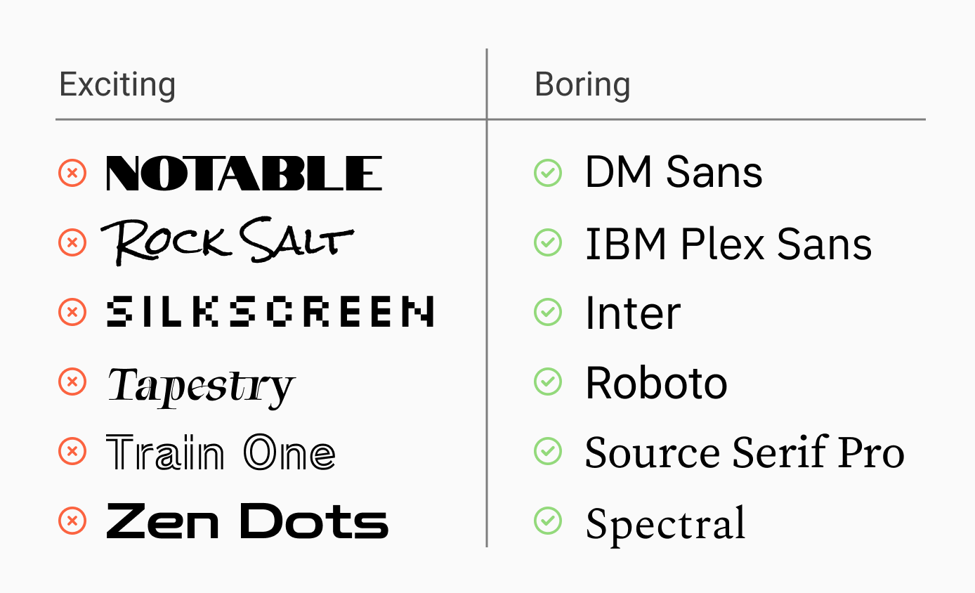
Yes, this is the second question you should be asking. Fonts fall into two main categories: exciting and boring. A more technical term for “exciting” might be “Display” or “Specialty” fonts, but I think the word “exciting” is a lot more practical because you can probably already picture the sort of fonts I’m referring to. In case you can’t, see below.
There are several issues with exciting fonts. The main problem is readability since most exciting fonts take longer to read (and some seem downright impossible!) This is why such fonts are often called “Display” fonts – they’re meant for headers and not body text. Still, headers carry important information and should be at least as legible as your body text in most business contexts.
Another issue with exciting fonts is that they’re often trendy. This sounds like a good thing until you remember the “trendy” jeans you bought in middle school that were very uncool by the time the next school year came around.
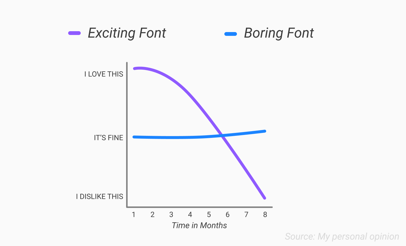
As you can see from that completely scientific graph, exciting fonts tend to decrease significantly in satisfaction as months pass. In contrast, choosing a boring font may not result in an initial dose of dopamine, but over time your satisfaction will hold steady and may even slightly increase as the font slowly grows on you.
All jokes aside, by choosing a “boring” font, you ensure that your work will stand the test of time. Additionally, if you’re selecting a font for branding purposes, it will enable your brand to grow and evolve without being defined by a niche font you chose three years ago.
Is it versatile?
Before we can answer this final question, we need to first address the elephant in the room. Yes, I’ve been misusing the word “font.” Let me explain.
When most people (and even many systems) use the word “font”, they’re actually referring to what’s called a “typeface”.
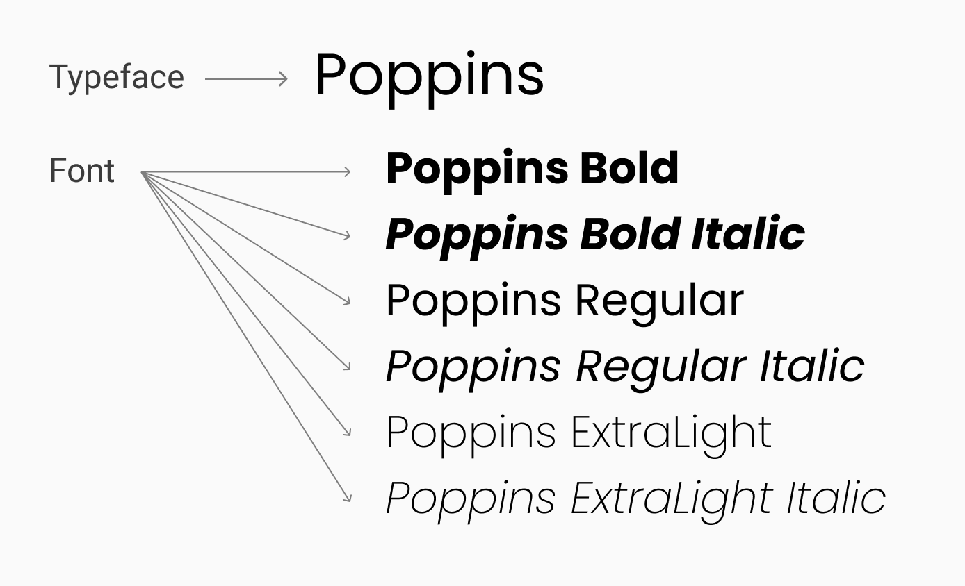
A typeface is a unified design for letters, numbers, and symbols. A font is an implementation of a typeface with a specific weight, style, and size. Some typefaces even have condensed and expanded fonts within them.
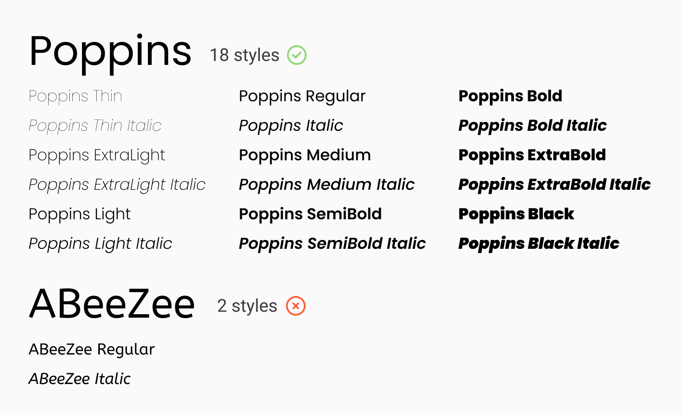
In the example below, Poppins is a Typeface with differently weighted and italicized fonts within. You can think of a typeface as a family of fonts.
The Poppins typeface actually has eighteen fonts within it! There are nine weights: Thin, ExtraLight, Light, Regular, Medium, SemiBold, Bold, ExtraBold, and Black. Then, there are italicized fonts for each weight.
In contrast, the ABeeZee typeface only has two font style options: Regular and Italic.
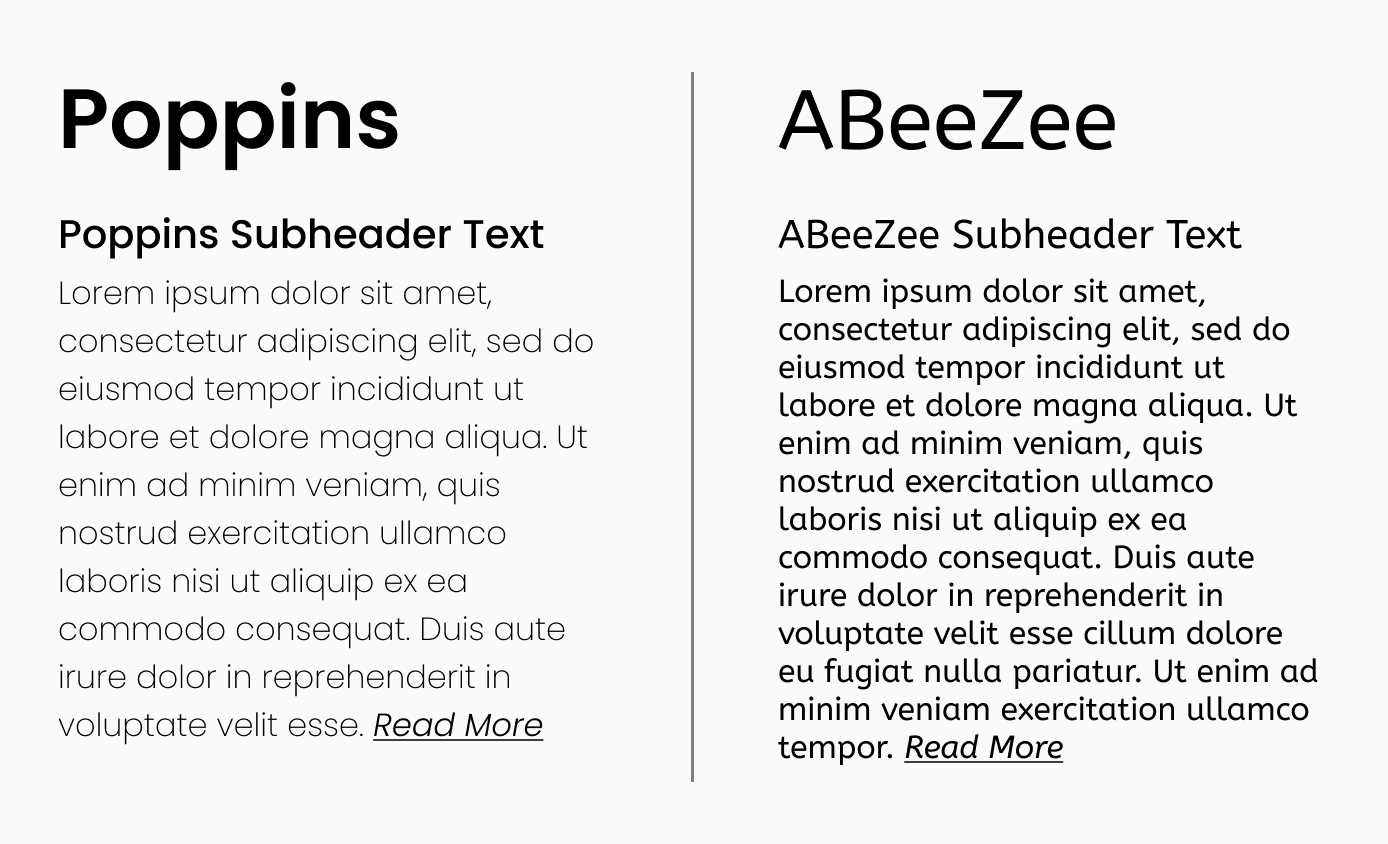
While Poppins may seem like it has an overwhelming number of styles, it’s the exact sort of font you’ll want to have because it will provide variety in your designs.
In the example below, it’s a lot easier on the Poppins side to figure out what your eye should focus on. The different text weights allow you to put extra emphasis on headers without leaving the font family.
In contrast, the ABeeZee side looks very uniform. This is because we only have one regular and one italic font to work with and therefore all we can change is the font size.
Next steps
Now that you’ve established a standard that your fonts should meet, you can ask the questions that most people start with: Does this font fit my business? Do I like the font? Does this font serve my target audience? Etc.
Check out a list of legal, boring, versatile fonts
here if you’re selecting a font from scratch.
Does this mean that if your current font doesn’t match the above criteria that you should automatically throw it out? Of course not.
Ultimately, fonts are just another tool to communicate information, and there are exceptions to every rule. An exciting niche font may help draw a certain type of customer in. A font with only a few styles may be all that you need. After all, if it ain’t broke, don’t fix it! (Except for the legal part – if that’s in question you should definitely figure that out and either obtain the proper licensing or use a different font!)
These questions aren’t meant to be restrictive rules. They’re intended as general guidelines that you as a non-designer can use to improve your design sense which is a valuable skill in any field.
Just remember – selecting fonts doesn’t have to be scary!

