With its strong real-time collaboration and cross-platform functionality, Figma has captured
over a third of the UI prototyping market, putting the youthful design giant second only to the combined might of the Adobe empire. It's an excellent option for remote teams and boasts a generous free tier that works well for small companies and personal projects... and it also happens to be the primary design tool of choice for our team at Sembit.
So what are you waiting for? Over your lunch break, you could join millions of Figma users and possess the basic skills needed to bring a design idea to life! Sound intriguing? Follow along for this quick tutorial.
Creating an Account
Sign up for a free Figma account
here. You can use an email/password combo or use your Google account for authorization.
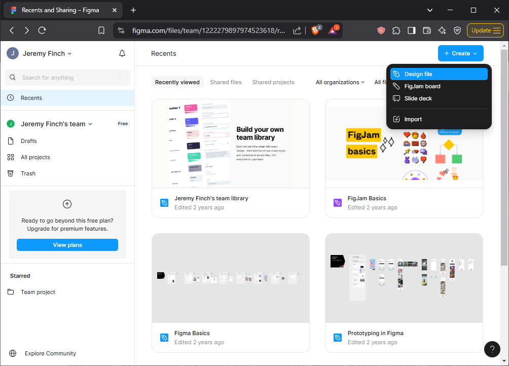
Once you've successfully logged in, click on the big 'Create' button in the upper right and create a Design File.
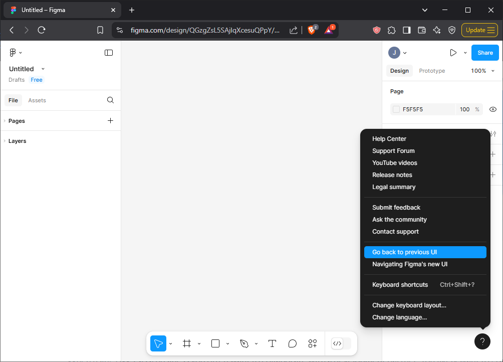
This will create an empty design file. Now, since I'm partial to the compact nature of the original Figma UI, click on the floating question mark button in the lower right and select 'Go back to previous UI' for the purpose of this tutorial. You'll be able to access the same features from either UI, so feel free to choose the interface that looks more inviting, since you can toggle this at any time from the question mark button.
To change the title of your design file, you can double click the word 'Untitled' in the black menu at the top.
Creating a Basic Screen
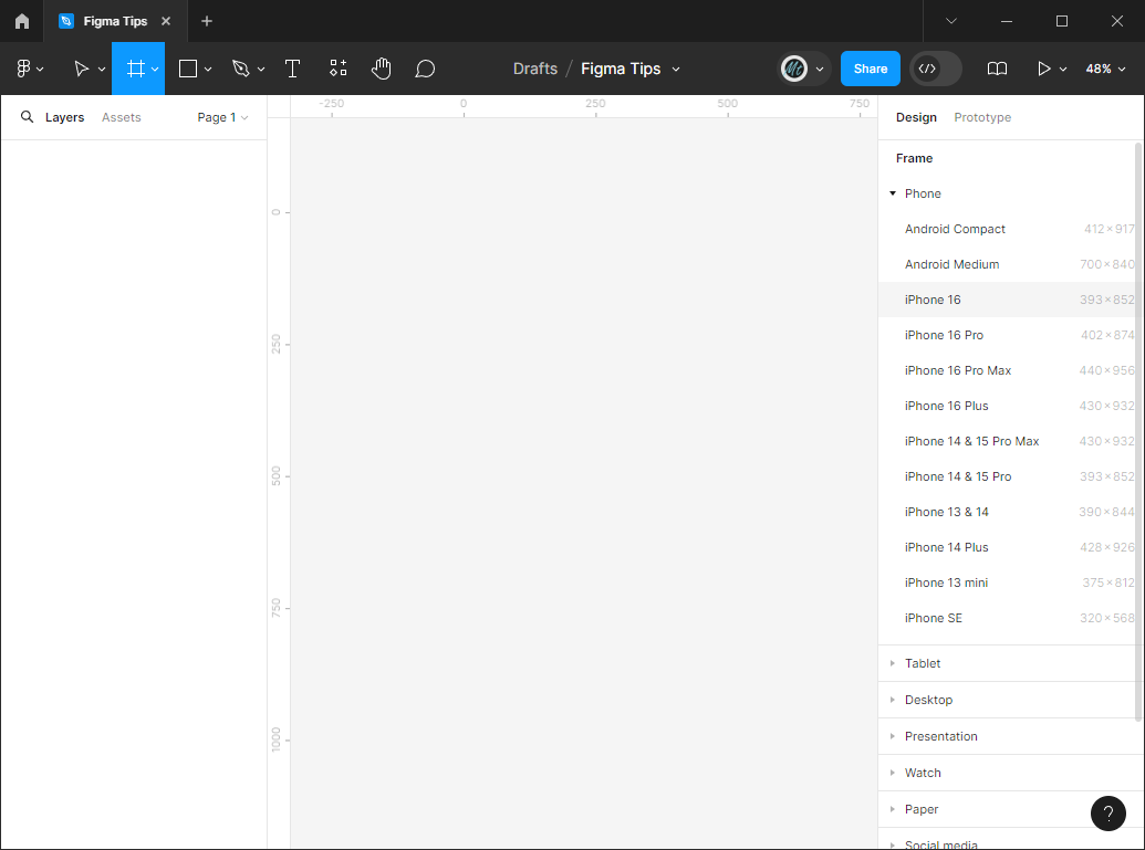
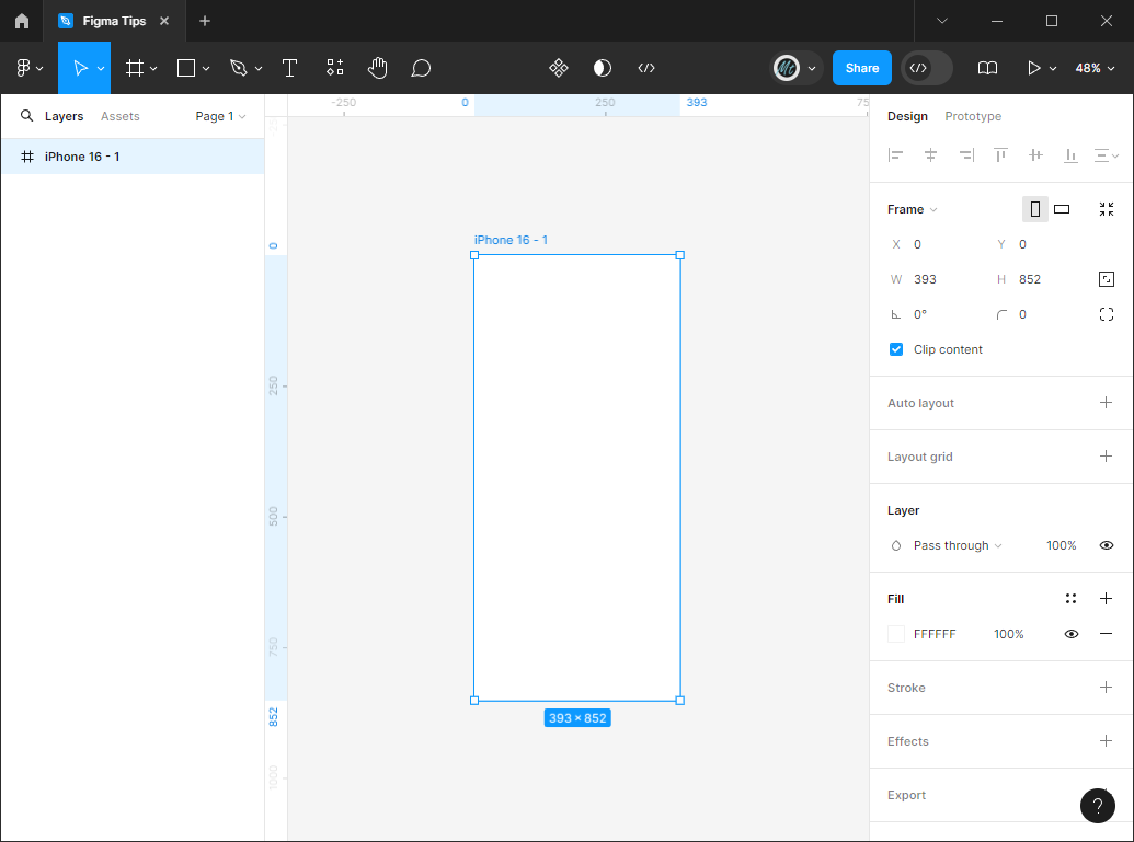
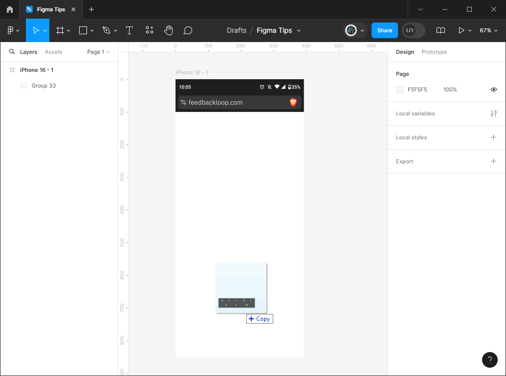
The basic building block of a Figma design is the 'Frame'. Click on the frame button highlighted in the image below to bring up a Frame selection pane on the right hand side of the screen. Selecting one of the options in this pane will insert a Frame with the specified dimensions. For our purposes let's select the iPhone 16.
This inserts a frame that stands out from the background. This is the canvas you'll be placing elements on as the first screen in your app. You'll notice a lot of options in the Design pane on the right hand side of the screen. These are properties of the frame. As we place more elements on the screen, selecting an element will pull up the properties for that element on the right hand pane.
Let's add some content! Since I'm designing a web app that will be viewed in a browser, I think it would be nice to add the browser elements so it looks a little more realistic.
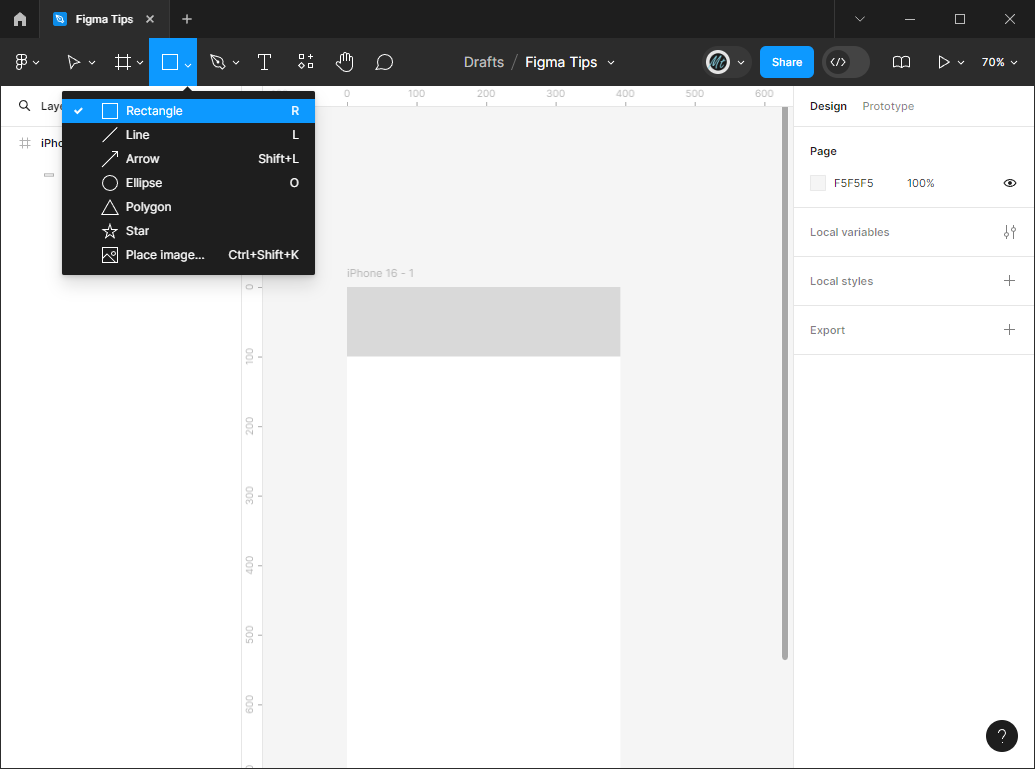
Click on the Shape button and add a Rectangle. It should detail to Rectangle, so after clicking the button with the square icon, you'll be able to use your cursor to draw a rectangle within the frame we just created.
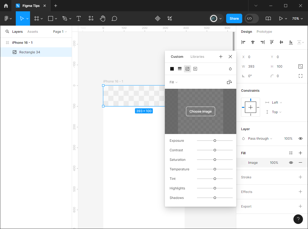
Click on the square next to the hex code in the 'Fill' section of the Design pane. This will pull up your fill properties popup that contains solid colors, gradients, images, and video. Let's select the small Image icon and click the 'Choose image button'. This will bring up a file dialog where you can select the image you'd like to fill the rectangle.
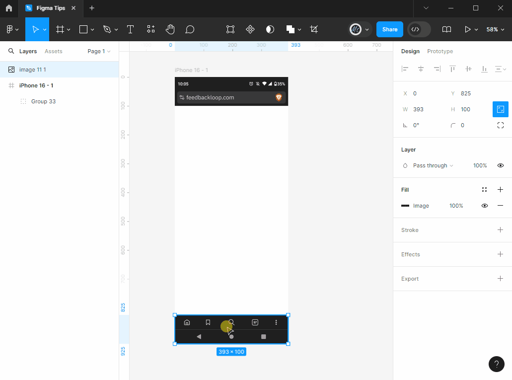
If you want to follow along exactly, you can right click the images below and save them to your computer. The 'BrowserTop' image will go at the top of your frame and the 'BrowserBottom' image will go at the bottom.
You can also drag images directly into Figma from a file folder. Try dragging the BrowserBottom image into your design from your Downloads folder!
Depending on where you dragged the image, it may or may not be 'inside' your design Frame. Try dragging the image in and out of the frame and notice that when your cursor is inside the Frame, the parts of the image outside the frame are hidden. This is because a Frame is much like a window you're looking into. The scene outside is larger than what you can see within the window's bounds.
Figma has settings where you can purposely leave things overflowing the Frame and scroll while presenting the prototype, but we'll leave that for another time. For now, just make sure that any elements you want on the Frame are indented under the Frame in the left hand panel. If the element isn't indented under the Frame, it won't be shown on the screen when you present it.
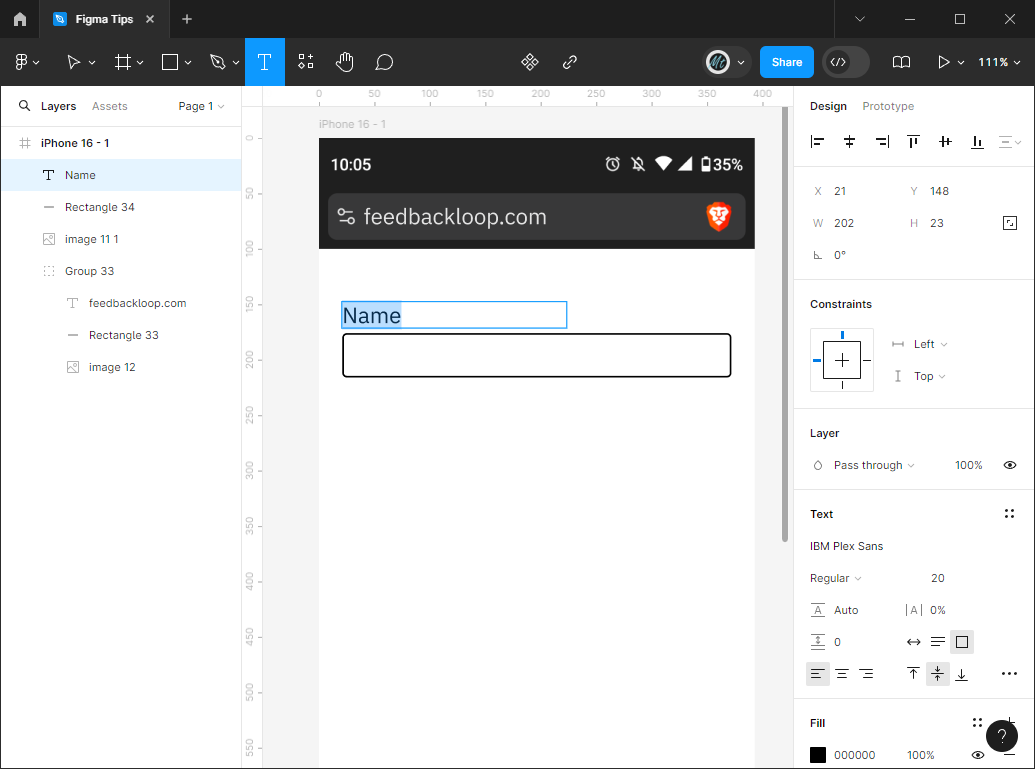
I'm envisioning a simple screen in this app that will allow an employee to submit feedback, so we'll need at least one textbox!
I'm envisioning a simple screen in this app that will allow an employee to submit feedback, so we'll need a textbox. Textboxes are usually comprised of... you guessed it - some text and a box!
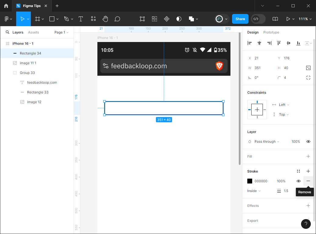
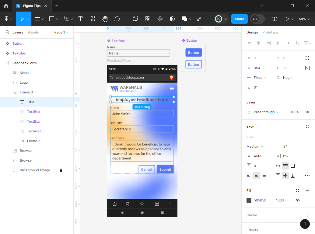
Use the same Square button and create a rectangle shape in the screen Frame. You can adjust the fill color, the stroke (or border) color and width, the border radius (in the image below it's the curved line with the '4' next to it in the second section of the right-hand 'Design' panel), and even effects such as drop shadows.
For our purposes, I'm adding a border radius of 4 and increasing the stroke width to 1.5.
Next, click on the 'T' button in the top toolbar and add a label above the field. You can change the font, font size, line spacing, paragraph spacing, and text alignment all from the 'Text' section of the right-hand pane when a text element is selected.
Add a second text element inside the textbox as the placeholder text and try increasing the font size to 22.
Creating Components
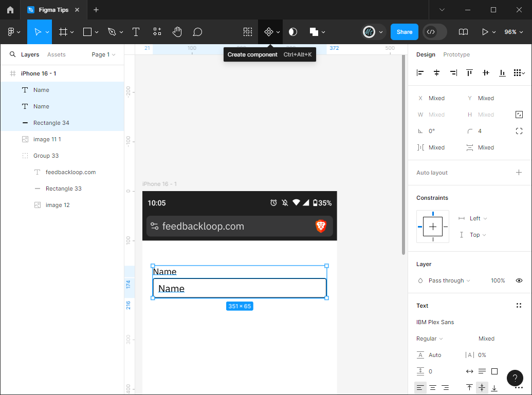
Now we're going to create what's called a 'Component' in Figma. Components are reusable groups of elements. To do this, select the two text elements and the outlined rectangle and click the 'Create Component' button in the top menu.
Now we're going to create what's called a 'Component' in Figma. Components are reusable groups of elements. To do this, select the two text elements and the outlined rectangle and click the 'Create Component' button in the top menu.
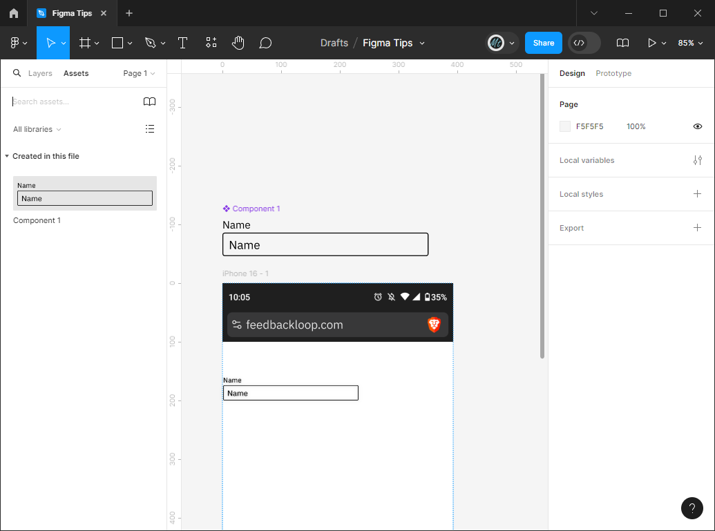
Drag the group outside of the frame and you'll notice that it's under the title 'Component 1'. To use the component, click on the 'Assets' tab at the top of the left-hand pane and find the component under 'Created in this file'. You can drag this component from the sidebar onto your frame as many times as you want.
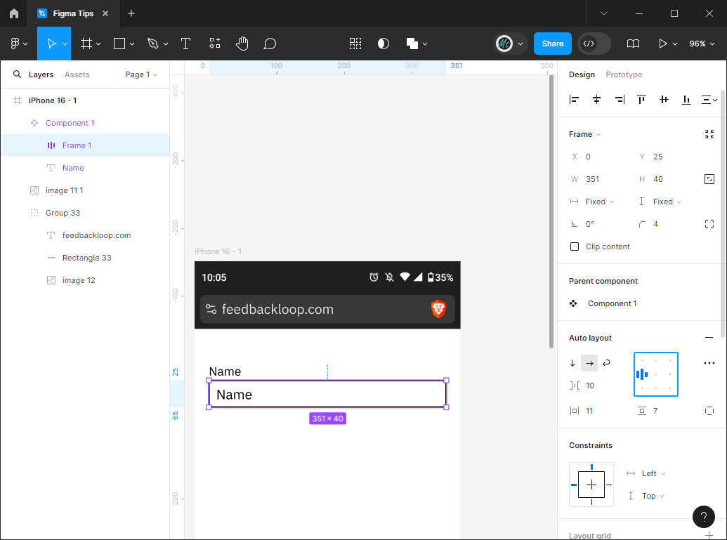
Now, let's select the rectangle and placeholder text in the master component (the component we dragged outside of the frame with 'Component 1' above it.) Once those two elements are selected, click the '+' next to 'Auto layout' in the right-hand pane which will add an auto layout to the elements. This puts them in their own mini Frame which allows for automatic spacing and alignment.
This will likely place your text element in the center of the rectangle. To fix this, take a look at the grid-like square in the 'Auto layout' section and note the nine dots. These dots indicate the alignment of a smaller element within a larger one. If you want the item to align in the center left, click the dot as shown in the image below.
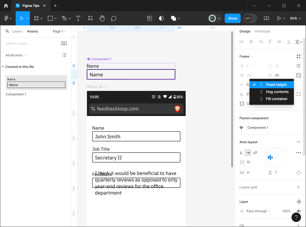
Now, if you want enough room to be able to type whatever you want, double click on the Frame you just created until you have the placeholder text selected. In the upper-right hand side, you'll see x and y positioning, width and height, and then fixed and fixed which indicate that the width and height of the element is currently fixed.
Now, if you want enough room to be able to type whatever you want, double click on the Frame you just created until you have the placeholder text selected. In the upper-right hand side, you'll see x and y positioning, width and height, and then fixed and fixed which indicate that the width and height of the element is currently fixed.
To change this property, click on the 'Fixed' under the Width (or 'W') property and select 'Fill container' instead. This will allow the text field to fill the rectangle.
Drag a few components onto your Frame and add some values to them. I've created Name, Job Title, and Feedback fields for my sample form. However, when adding placeholder text to the Feedback, you might notice that it's quickly overflowing its container. You may have also noticed that if you try to change the size of the box on the Feedback textbox, you won't be able to. This is because all the textboxes are children of the Component you created earlier. This means to change the children you'd need to change the parent Component.
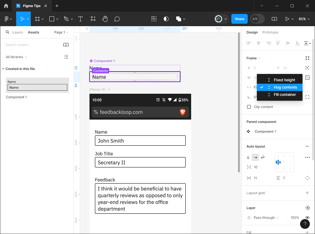
To make your component more dynamic, select 'Frame 1' within 'Component 1' (navigate back to the Layers tab of the left-hand pane to assist with this.) Once the Frame is selected, click on the 'Fixed' label under the object's Height at the top of the design pane. Change that to 'Hug contents' which will expand to hug vertically whatever contents the frame has.
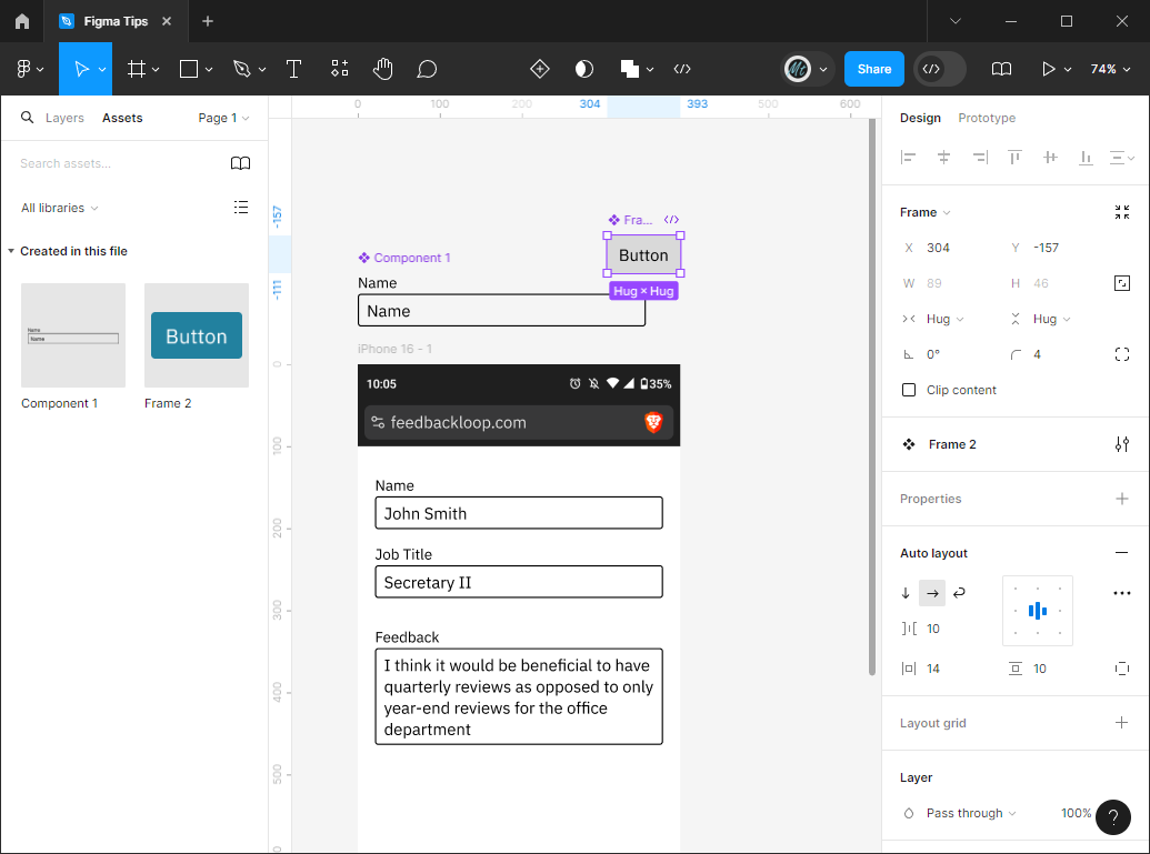
Time to test your memory! Let's make a button component by adding a rectangle, adding a border radius to the rectangle, adding a text element on top, selecting both elements and adding 'Auto layout', selecting 'Hug Contents' for both Width and Height, and then selecting the Frame and clicking the 'Create Component' button.
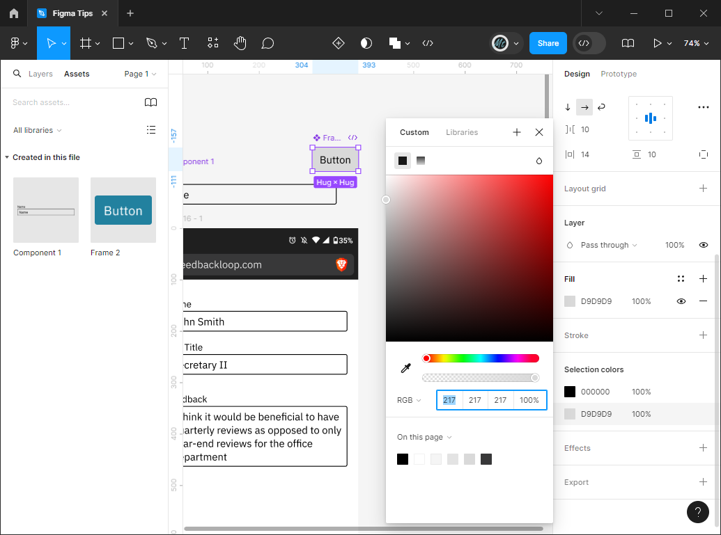
Gray isn't the most exciting color for a button, so let's change it. Select the component you just created and scroll down in the Design pane until you see 'Selection Colors'. You should see two colors - one for the text and one for the button. This section will include all the colors from the elements you've selected. By changing one of these colors, it'll change the fill colors for any elements you've selected with that color. For instance, if our selection included two rectangles with the color grey, changing the color to a blue in the 'Selection Colors' area would change the color of both rectangles, whereas if you select only one rectangle and change its 'Fill' color, only that one rectangle will be changed.
You have several different options for selecting a color. You can use the color picker, you can pick a color from the bottom section of recently used colors, or you can click on the eyedropper icon next to the color bars and use it to pick a color off the page.
I also took the time to change the color of the main textbox to a medium gray and changed the label text above the field from 'Regular' weight to 'Light' weight in the 'Text' section under the name of the font. Now when I squint at the text field, I see the value inside the box as the most prominent which is what I want.
Color Variables
In most applications you have a color pallete of a few colors you want to use over and over again. In Figma, you can handle this consideration easily by creating color variables so you can test out different colors easily in your designs.
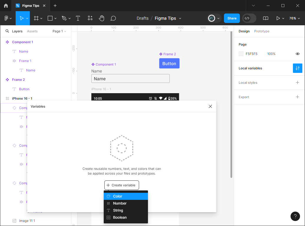
To create a variable, click on the background so nothing is selected and click on the dial icon next to 'Local variables' in the right-hand pane. This will reveal the 'Variables' window where you can click 'Create variable' and then 'Color' for the type of variable.
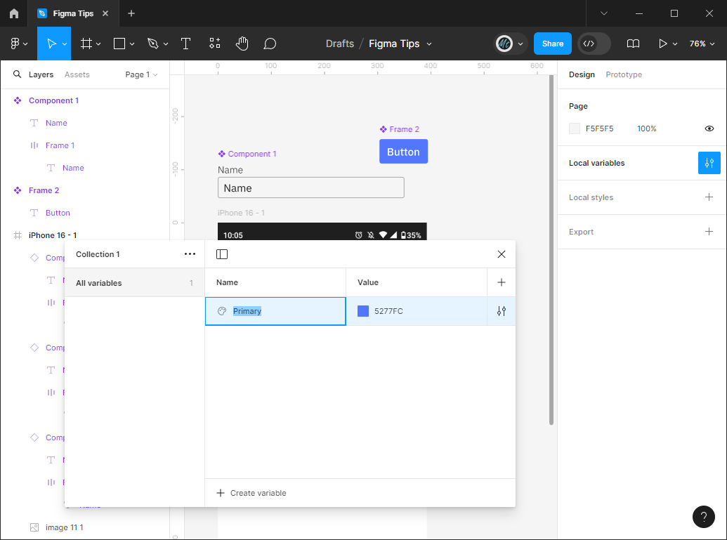
This will create your first Variable entry. To change the variable name, double click on the word 'Color' in the 'Name' column and type the name. I often use the names like 'Primary' and 'Secondary' for major color themeing throughout the app, or names like 'Text' and 'Action' for different types of elements, or names like 'Error' or 'Inactive' for different states. To change the color, click on the square next to the hex code in the 'Value' section and select a color like you did with the 'Fill' attribute.
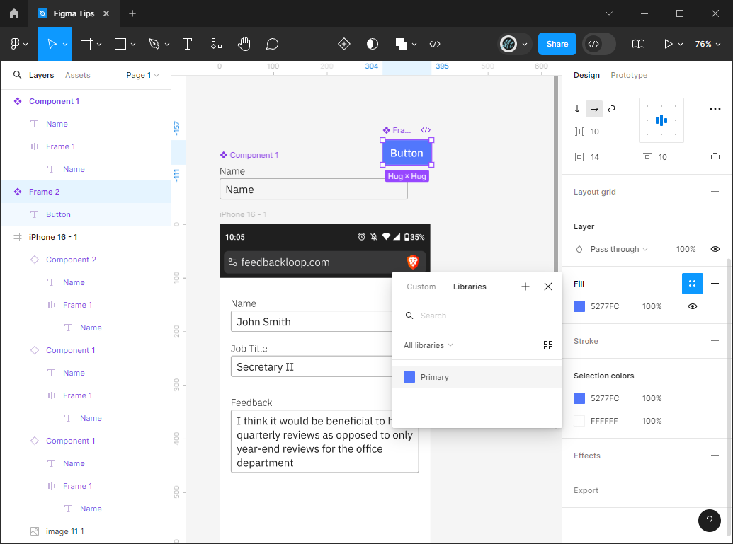
Now that you have a variable, it's time to use it! Let's change your button color to the 'Primary' color. To do this, select the Frame of the button and click on the 4 dot icon in the 'Fill' section. This will bring up a list of variables. Select the variable you just made.
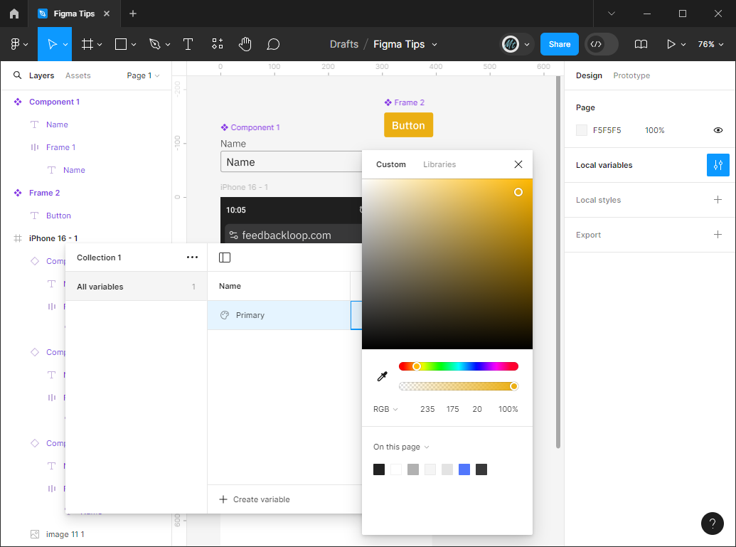
If you wanted to change the main color of your app to yellow, just click on the background and go back to the variable pane by clicking on the button next to 'Local variables' and change the value next to 'Primary' to a yellow color. You'll notice that the color of the button changes as well. This is especially handy when you have many screens and don't have a color scheme decided on right away. Just create placeholder colors/variables for different groups of elements and then change the colors later as applicable.
Component Variants
I went to the 'Assets' left-hand pane and added two buttons to my feedback form: a Submit button and a Cancel button. However, I don't want the Cancel button to be so prominent. We need another button type that isn't as eye-catching!
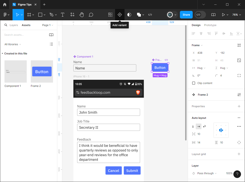
To accomplish this, select the button component and click the icon button of a diamond with a plus inside (the 'Add variant' button). This will create a second copy of the Button component under the existing one. This is technically another version of the same component.
I added a 'Stroke' to the button and clicked the '-' on the 'Fill' property to remove the background so there's just an outline around the text. Next, I changed the color of text to the Primary color I chose earlier. Now I have an outline button as the second version of the component.
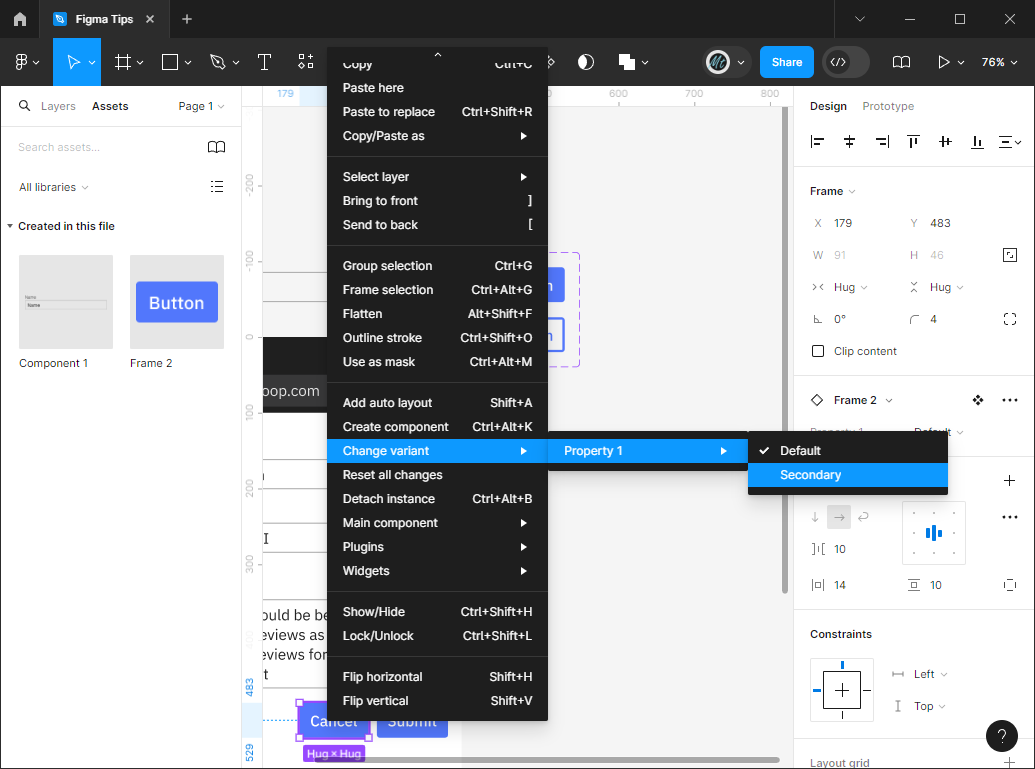
To make the 'Cancel' button adhere to this second button look, right click on the 'Cancel' button and mouse over 'Change Varient' > 'Property 1' then select the second option for the variant. This will make the Cancel button look like the outline button we just created.
Figma Plugins
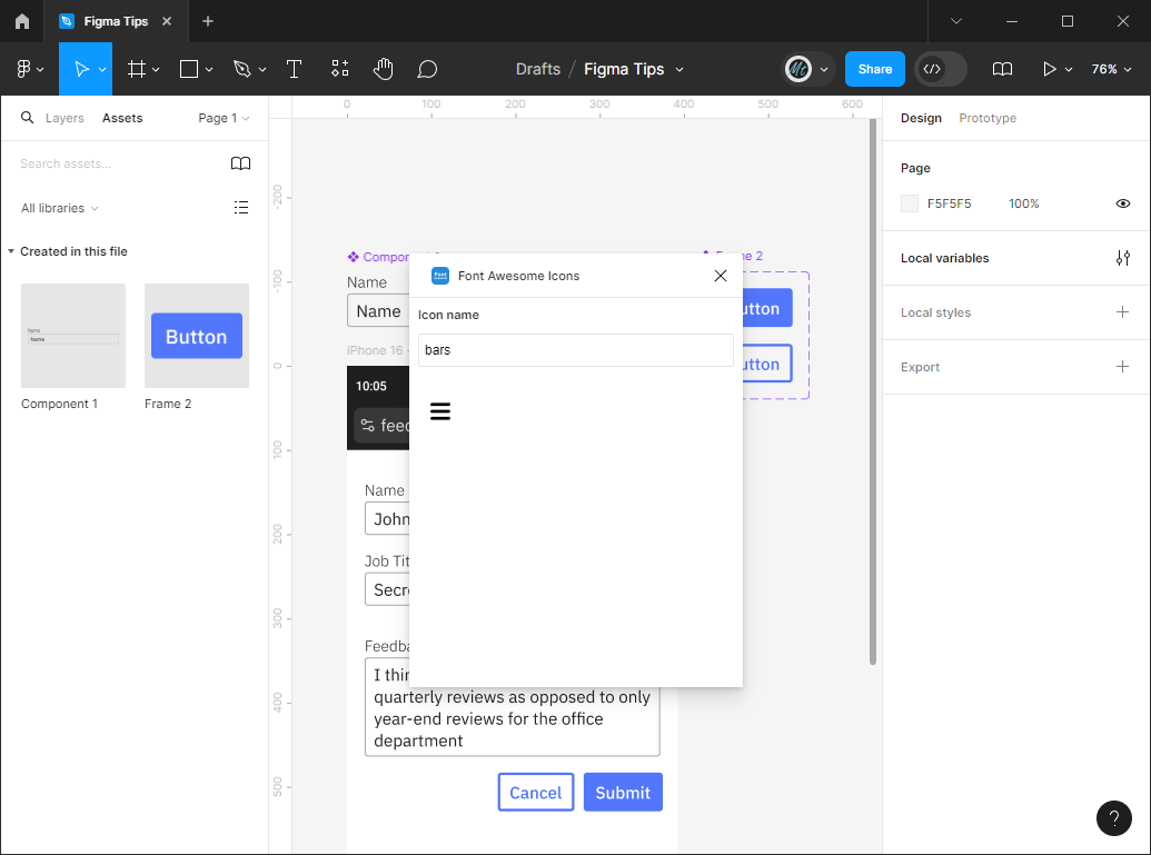
It'd be nice to have a menu icon so the mockup looks a bit more realistic. To add one quickly, let's use a Figma icon library plugin.
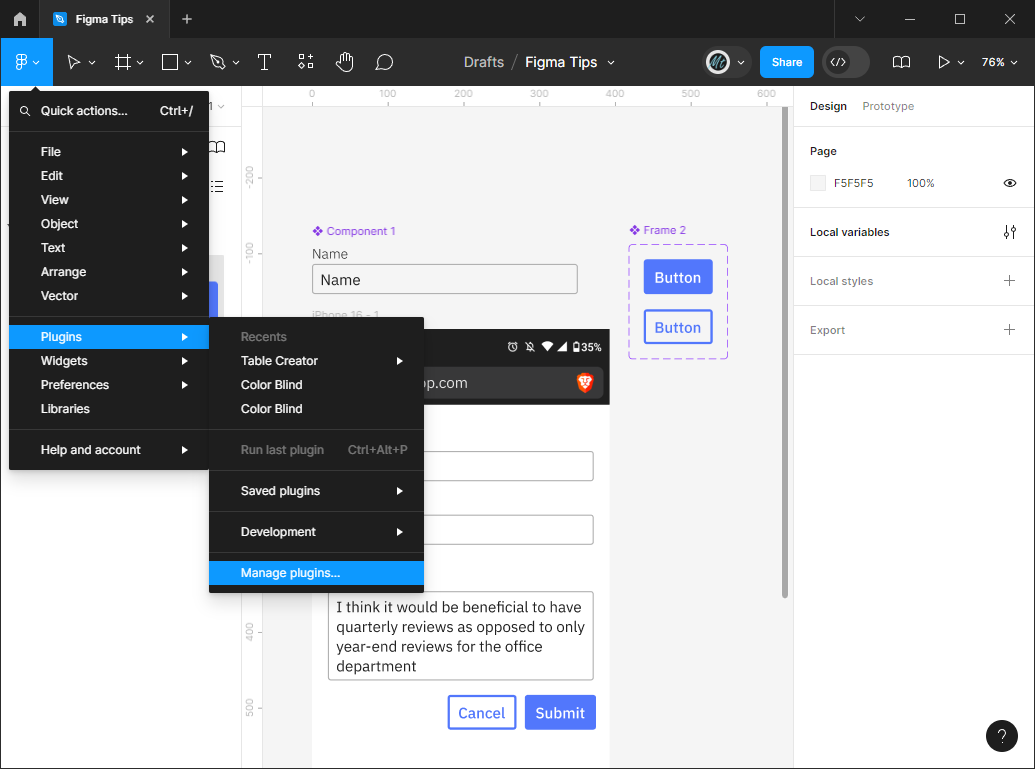
Click on the main figma menu button in the upper-left and go to 'Plugins' 'Manage plugins...' This will bring up a plugin search window where you can look up community-made plugins. Search 'Font Awesome Icons' and select the one made by Vyacheslav Myskov.
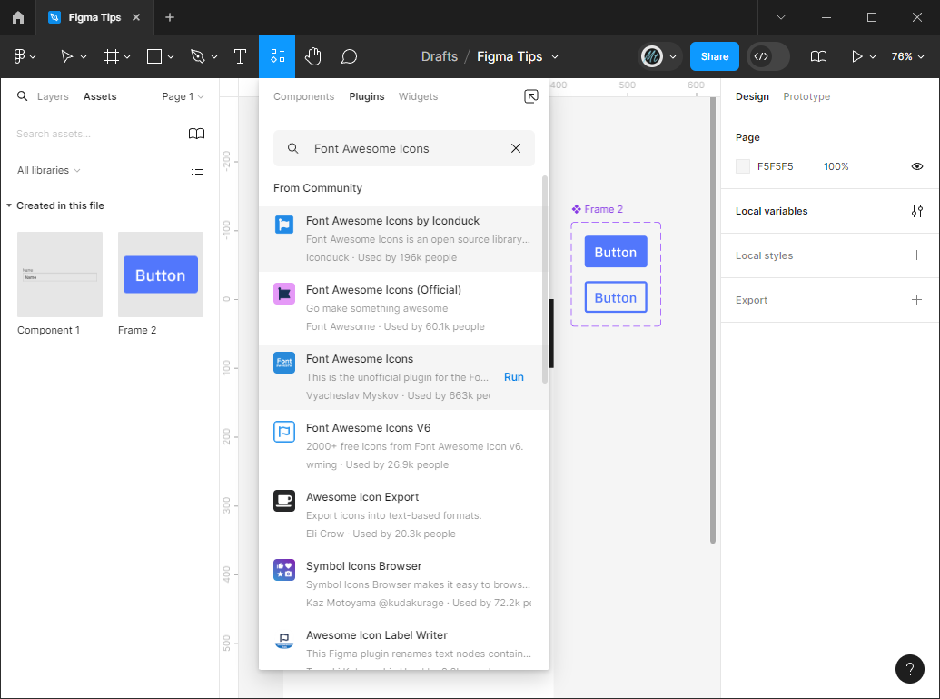
This will pop up a window where you can search for a Font Awesome icon. Search for 'bars' and click on the resulting icon, which adds the svg icon into your project. You can move the icon around, change its color with the 'Fill' property, change its size, etc.
Staying Organized
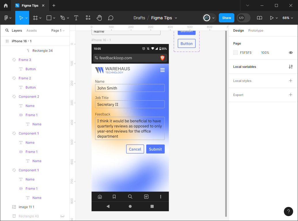
It looks like we've taken a jump, but not nearly as big of a jump as you'd think. I added a background image by dragging a mottled image into my screen Frame (this will put the image on top of your existing elements) and then clicking the '[' key on the keyboard which will put that element at the bottom of the stack.
Next I added the logo image in the upper left and changed the bars icon color to white to stand out better on the blue background.
I also took some time to rename the elements in the left-hand 'Layers' pane. You can rename by double clicking on the name in the left-hand pane or by double clicking on the little label text that appears above the frames in your work area.
You might notice that now when you try to select elements on your screen that the background of your Frame is always trying to get in on the action. If this is irritating you, you can go to the background entry in the 'layers' section and click the little lock icon to lock it in place. This means you won't be able to select it until you click it again to unlock it which is exactly what you want for something you want to stay in the background! You can also click the eye to show/hide the element.
Auto Layouts
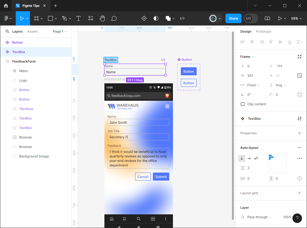
Previously when we were using auto layouts, it was for adding a piece of text within a rectangle shape. However, you can also use auto layouts to structure rows and columns of elements.
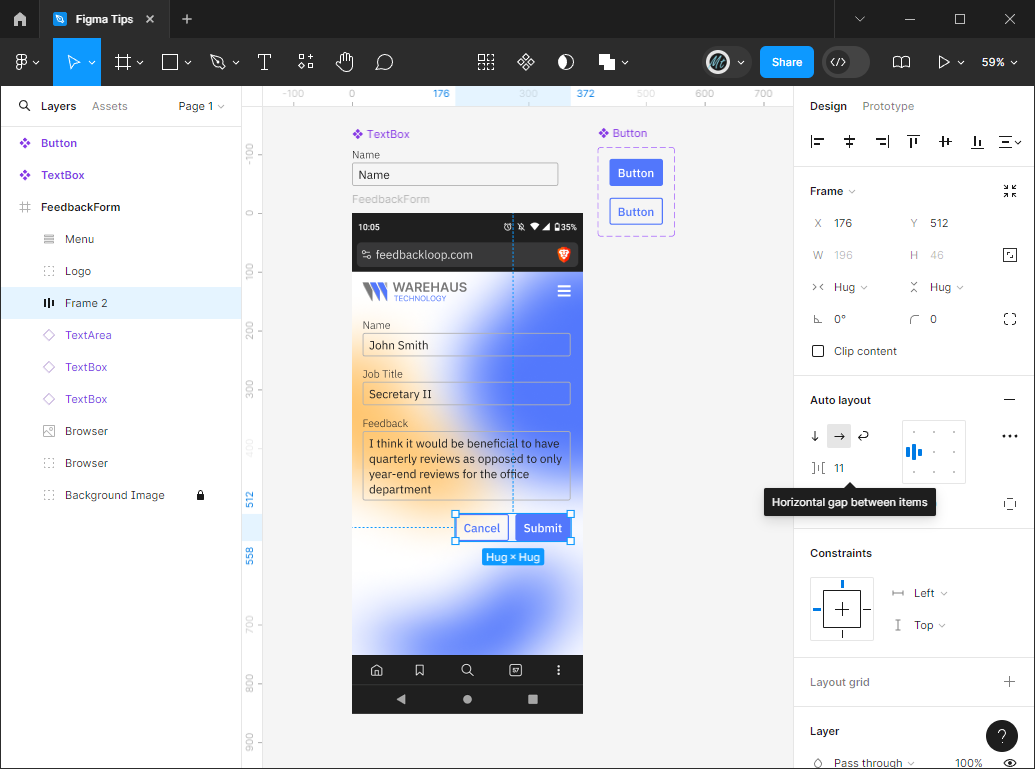
Select your two buttons and click the '+' next to 'Auto layout' to create a layout. You can change the spacing between the elements by changing the numeric value as shown below.
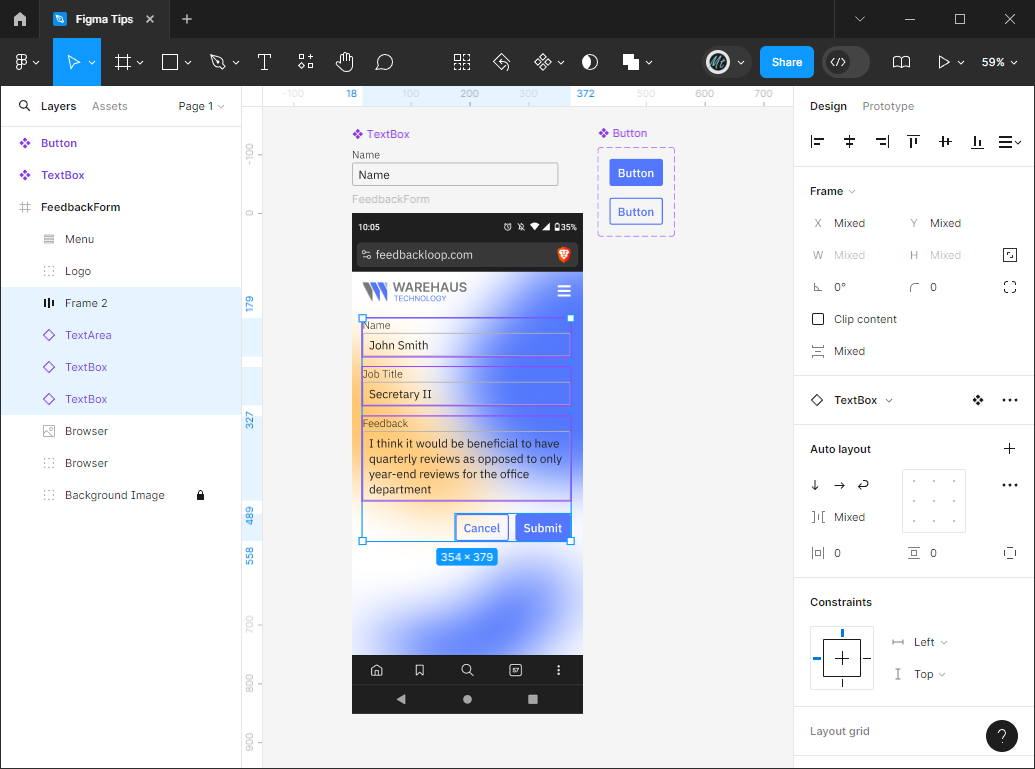
Auto layouts can nest! Select the layout you already created as well as the stack of textboxes above and click the '+' button next to 'Auto layout' again. This time you get a vertical list because of how the elements are positioned prior to creating the layout.
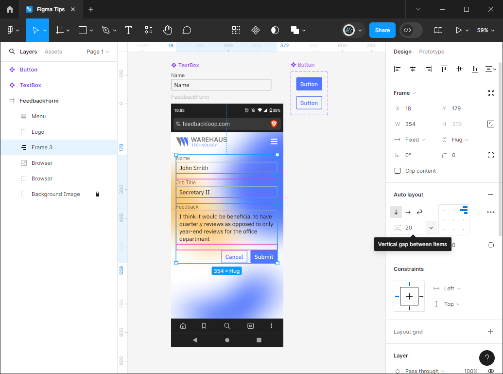
You can change the direction of the layout by clicking the arrows under the word 'Auto layout'
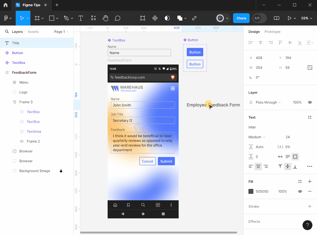
One handy thing about auto layouts is that you can drag other elements into them and it will place it properly into the layout with spacing under it, etc. Try creating a title for your form and then drag it in and out of the auto layout. If all else fails, you can drag the element inside 'Frame 3' in the 'Layers' left-hand pane.
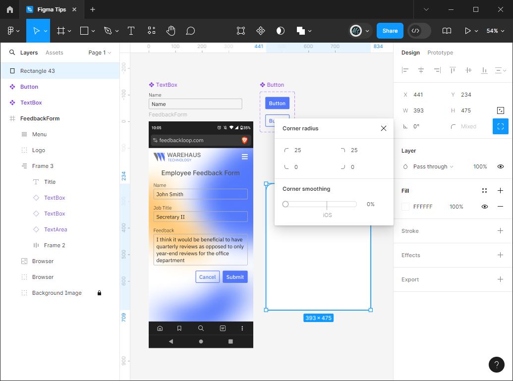
These textboxes are getting a bit hard to read with the busy background. Let's add a white background to part of the screen by creating a rectangle and rounding some of the edges. If you click on the button next to the border radius property in the upper-right of the 'Design' pane, it will open a little 'Corner radius' menu where you can add custom radius values to each corner.
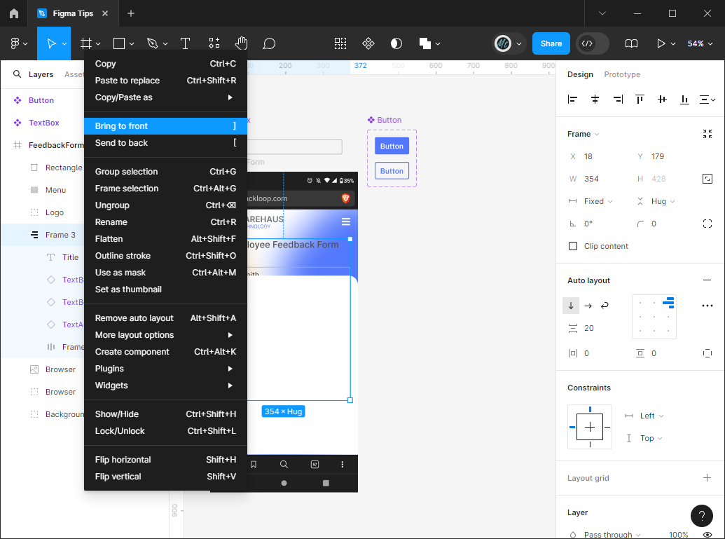
We're facing the same problem as we did before with the background being on top of the elements we want to display. However, if we use the same trick of sending the background to the very back, it will go behind the blurred background as well, which we don't want. This time, lets select Frame 3 and right click to select 'Bring to front' (or use the ']') to bring the Frame in front of the white background.
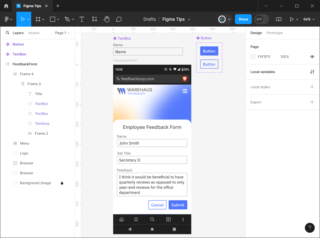
If you're following along, your screen should look something like this:
Adding a second screen
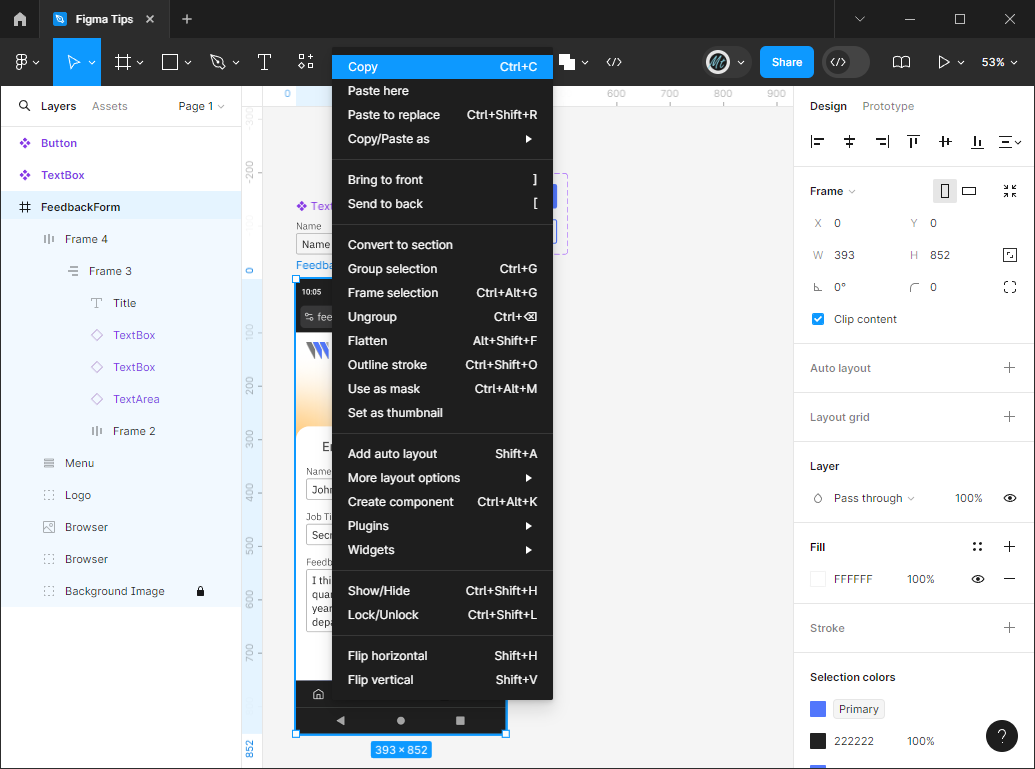
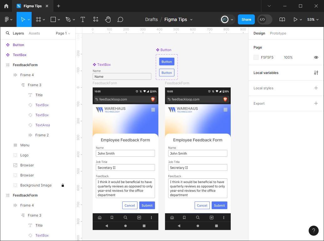
Now let's create a second screen to be our 'Feedback Received!' screen after the user presses the 'Submit' button. To do this, select the entire Screen and either right click 'Copy' or use Ctrl+C Ctrl+V to duplicate the screen.
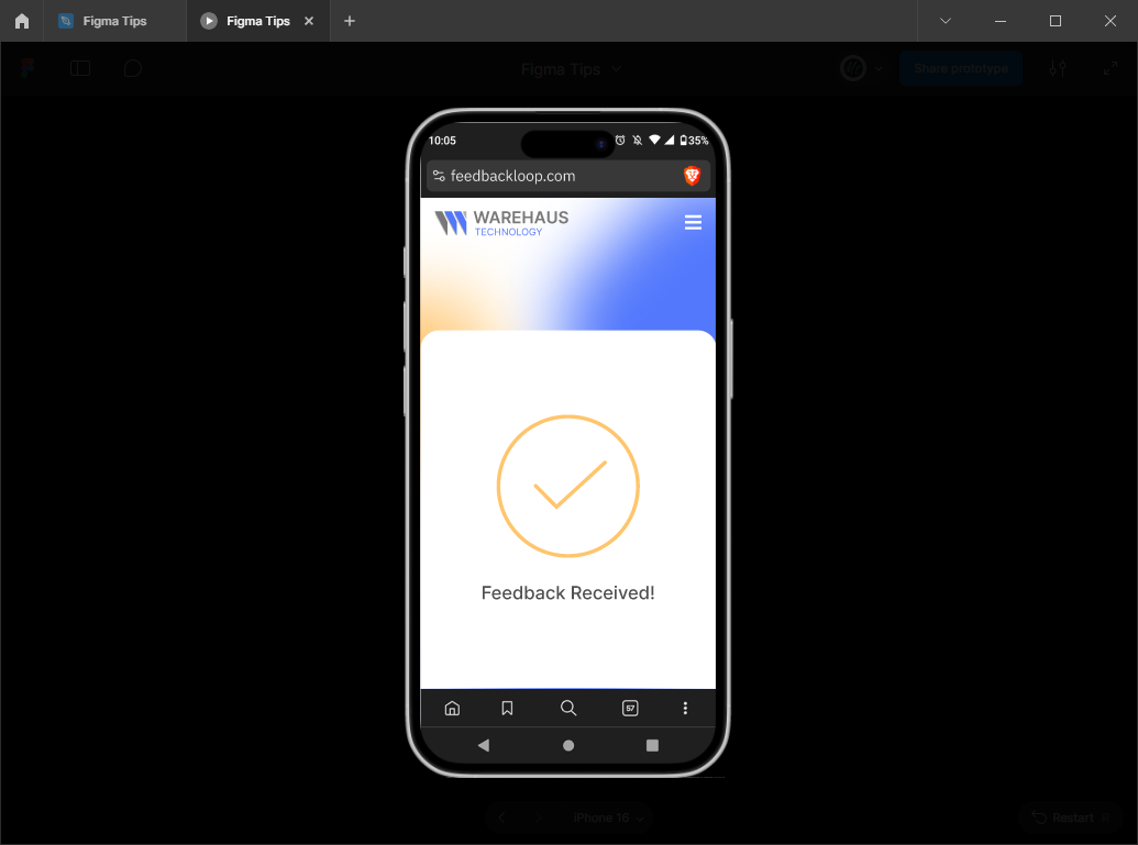
Delete the fields and the buttons and rename the title to 'Feedback Received!'
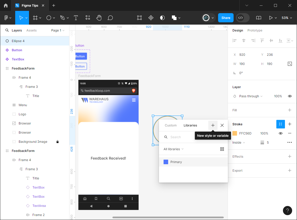
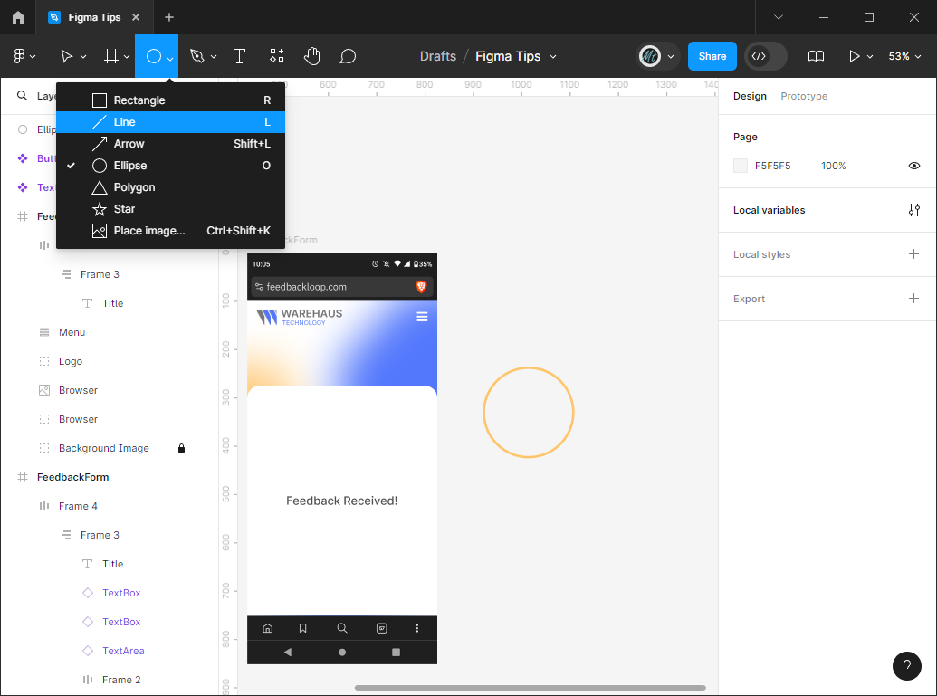
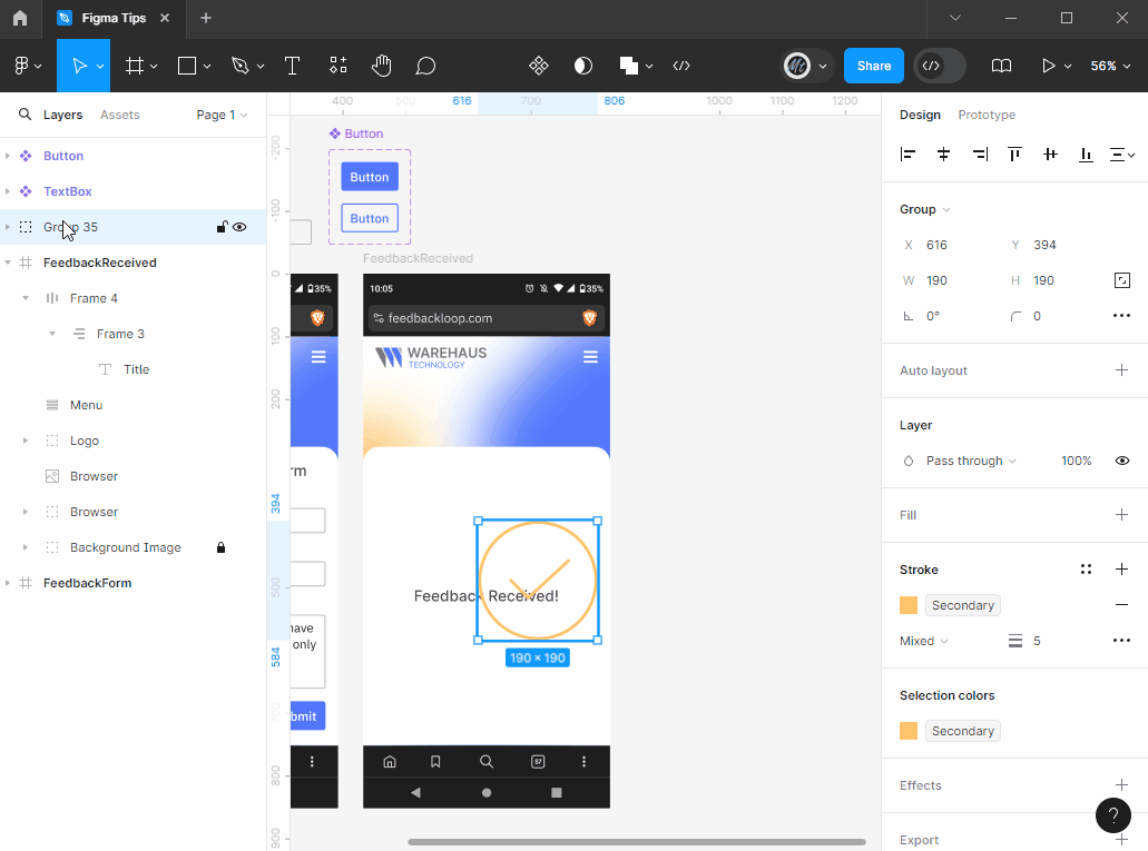
I think a large checkmark icon would look nice, so I dropped down the rectangle button at the top and selected 'Ellipse' instead, which draws a circle. I removed the fill and added a stroke with a width of 5 in a yellow color.
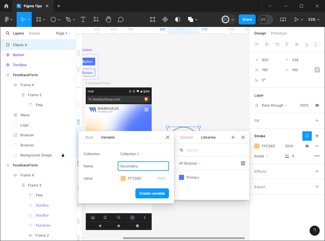
Let's make this our secondary color. Select the Ellipse and click the 4 dots symbol next to 'Stroke' and click the '+' button with the tooltip 'New style or variable'. This will open a mini window where you can name the variable and the color will be the color you already selected. Click 'Create variable' and the circle will have that variable as its color.
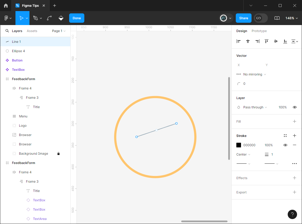
Now go back to that shape button at the top (it should have an Ellipse icon since that was the last shape used) and select 'Line'. This will allow you to draw a line. To create the bendy part of the checkmark, double click on the line and mouse over the center until you see a pen icon with a '+' next to it replaces your cursor. This will let you add another node to the line that you can then drag downward to create a checkmark shape.
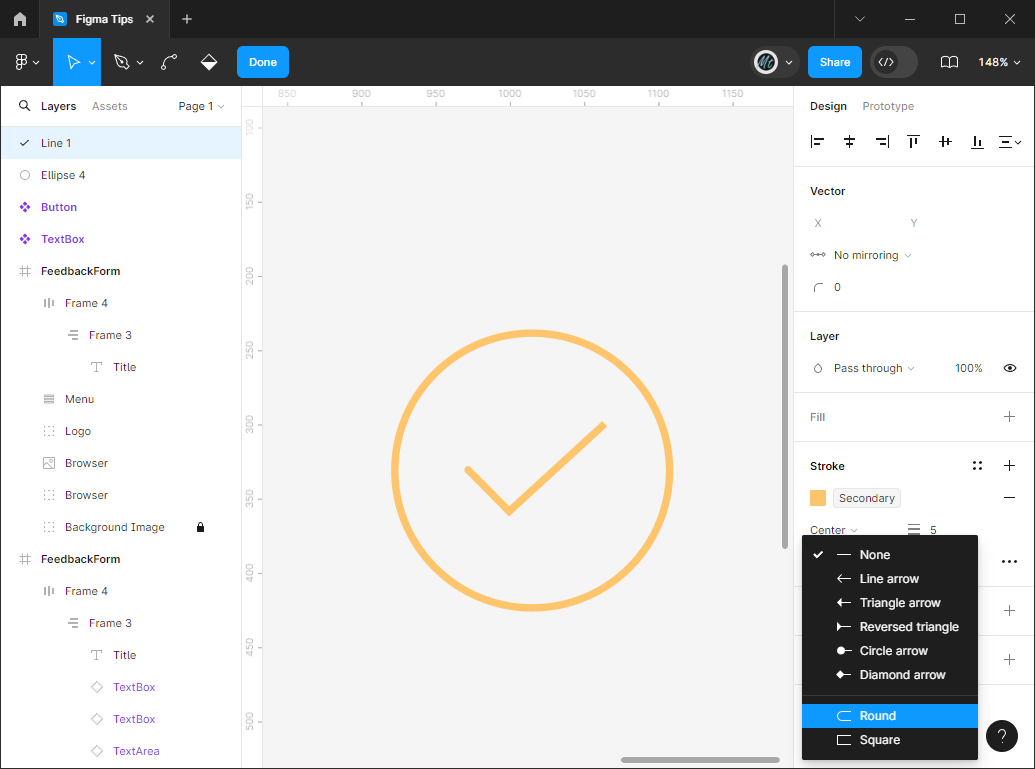
Lines have similar properties to the other shapes. You can increase the stroke width to 5 and use the 4 dot button to select a color variable to match the ellipse.
To achieve the rounded look, note the dropdowns under the 'Center' and Stroke width properties. These are the settings for the end caps of the line. Drop down both and select 'Round' instead of 'None'.
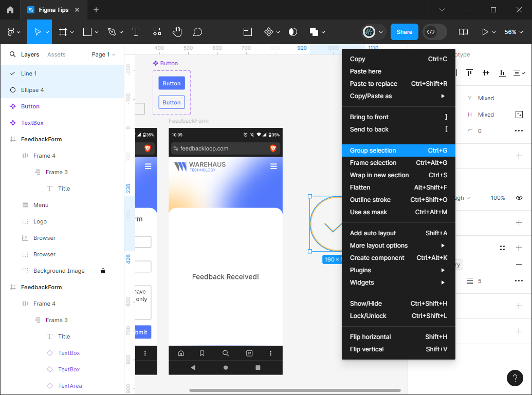
Finally, select both the Ellipse and the Line and either right-click and select 'Group selection' or use Ctrl+G to group the two elements together.
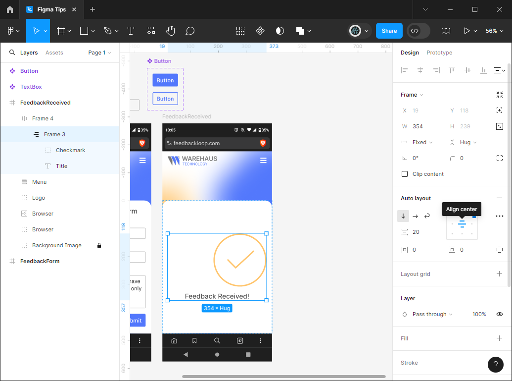
Now, drag the Group you just created into the Frame where your 'Feedback Received!' message is. Make sure to drag it all the way into Frame 3 so that it's part of the column with the text instead of in a row with the text.
Next, select Frame 3 and align the elements to the center.
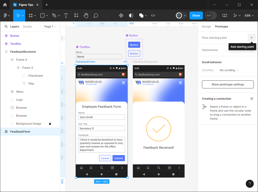
Creating a flow
In order to demo your mockups to clients or stakeholders, you'll need to create a flow where clicking on different elements will lead to different screens. This will simulate a user actually using the app.
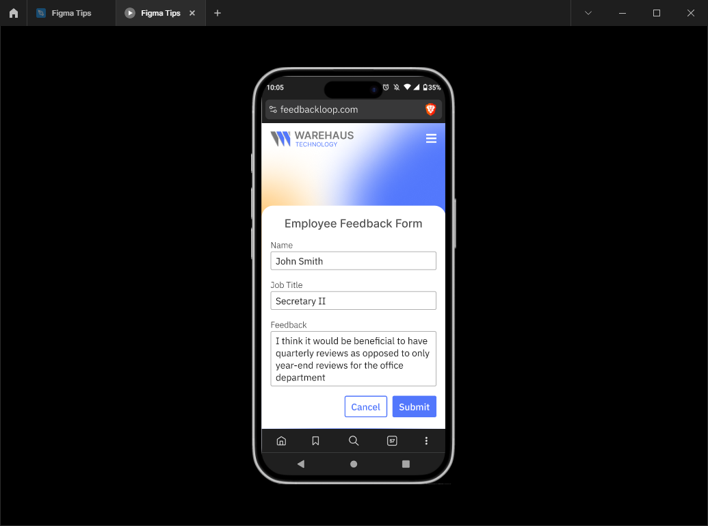
You'll need to start by picking a screen to be your starting place. Select a screen and click on the 'Prototype' tab of the right-hand pane. Now, click the '+' next to 'Flow starting point'. This will let you name the Flow something. I'm calling mine 'Submit Feedback' and starting on the screen with the filled out form.
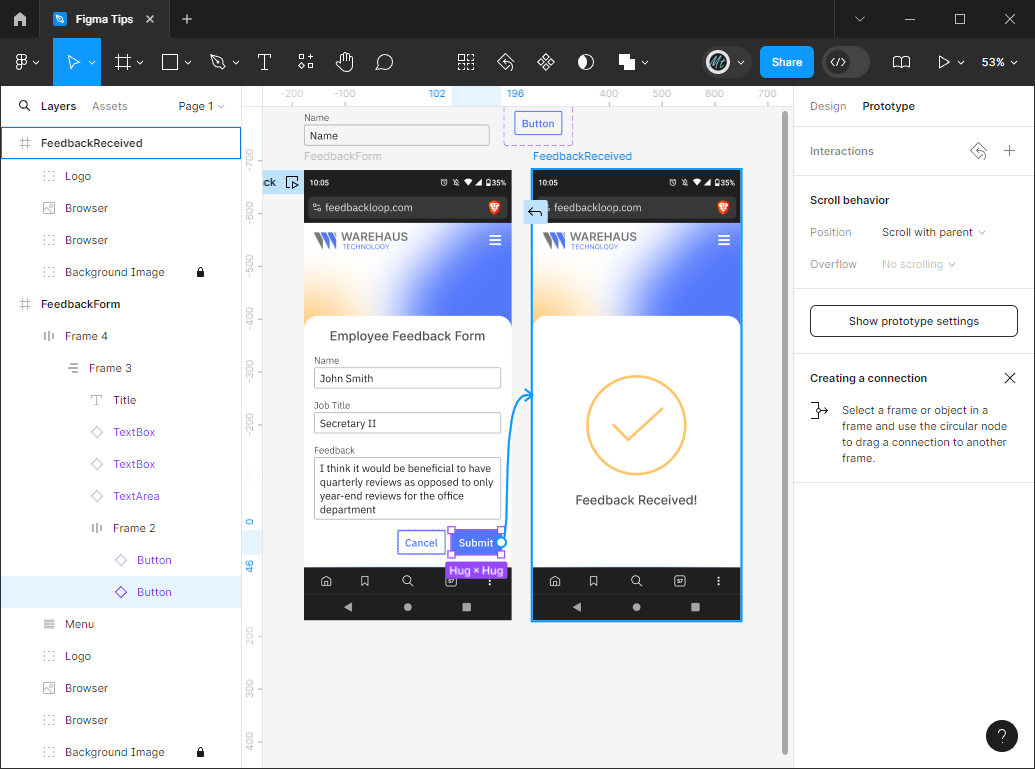
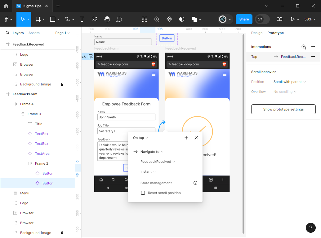
Now we need to add an Interaction. Logically, when you press 'Submit' you should be taken to the 'Feedback Received' screen. While you're on the 'Prototype' tab, clicking on elements and moving your mouse around will show little '+' signs when you mouse over part of the border of the selected item. Clicking on one of those '+' buttons will create an arrow that you can drag over to the screen you want to navigate to. If you accidentally click one, just drag it to empty space on the screen and it will disappear.
Drag an arrow from the 'Submit' button to the second screen we created. This should bring up a little interaction menu. This menu specifies the interaction at the top (default is 'On tap' which means when you click or tap the element) and allows you to select the screen and choose the transition. If you drop down the 'Navigate to' element, you'll see a lot of other things you can do with this Interaction feature, but let's stick with navigation for now.
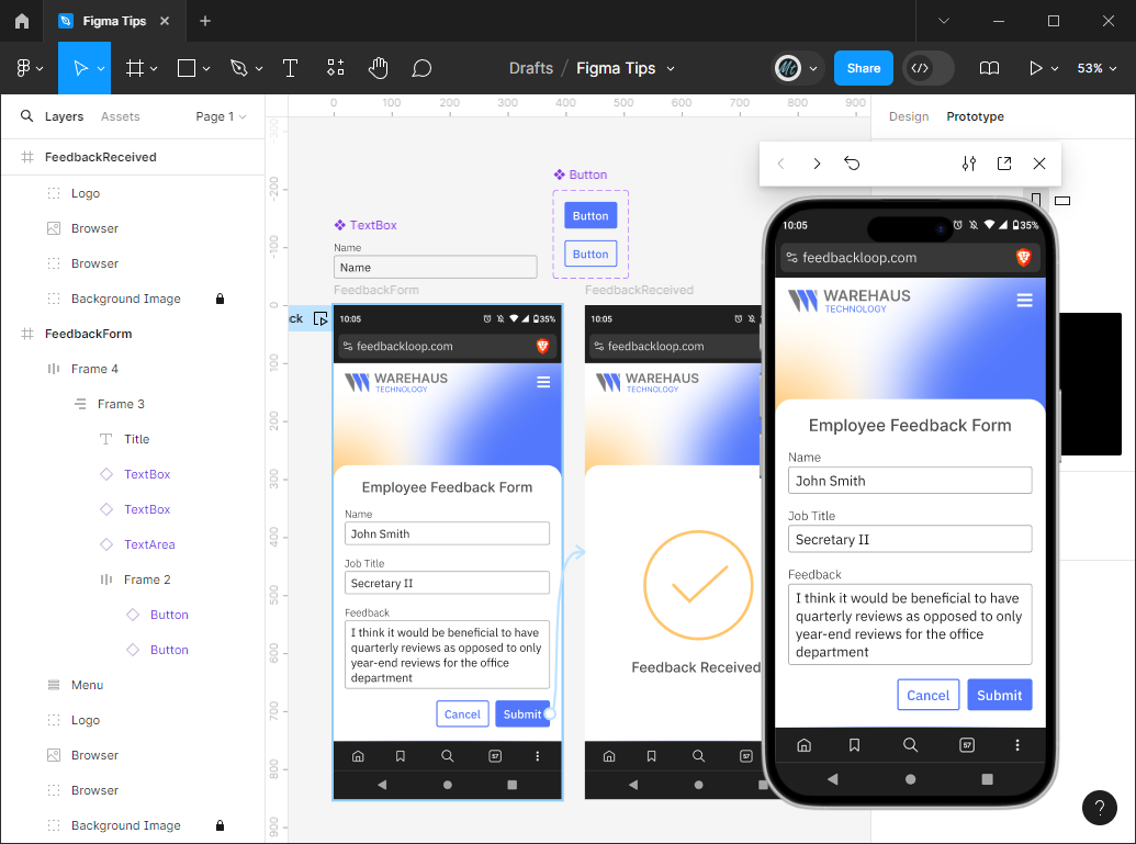
Now you're ready to see your screen in action! click the square with a play button in the corner icon next to the Flow you named and it will pop up a demo with the screen displayed. When you click 'Submit' on the prototype, it will navigate to the 'Feedback Received' screen! If you want to reset to the first screen, click the loopy arrow icon in the taskbar above the phone.
To enter presentation made, click the little arrow up from square icon in the white taskbar above the phone. This will open another window where you'll just see the phone. To access the flows you've created, click the sidebar icon next to the Figma logo in the upper-left. The taskbar defaults to hide unless you mouse over it. To show/hide the Figma UI if the mouseover is bothering you, use Ctrl+\.
Obviously this is a relatively simple example, but it demonstrates the basic functions in Figma that you'd need to create a mockup for an app or website idea you're trying to communicate.
You've been ordained to the ranks of Figma users. Now, go forth and bring your ideas to life!

