Visualizing Massively Parallel Dataflow in New E1 Processor
by Nathan Theophanes • 3 min read
A few months ago, our customer
Efficient Computer came to us with a request. Could Sembit create a dynamic visualizer to show what is happening inside their
E1 dataflow processor as it executes a program? This needed to be real, not faked up. They wanted an online "Playground" where users could enter any C code. The Playground would safely compile it, run it, and then show how the data was being routed to the array of processing elements that actually performed the computations.
Linux Lockdown
Our first challenge was creating a locked-down environment. After all, normally you want to avoid execution of arbitrary code, especially for a low-level language like C. That topic deserves its own article, but the short version is that we used linux namespaces and ran the code as an unprivileged user who had no access to any namespaced resources. That includes network, inter-process communication, users, and cgroups. We isolated the program to only be able to write to its own custom folder, and only mounted the files necessary to compile and run it, such as system libraries.
Web-based Code Editor
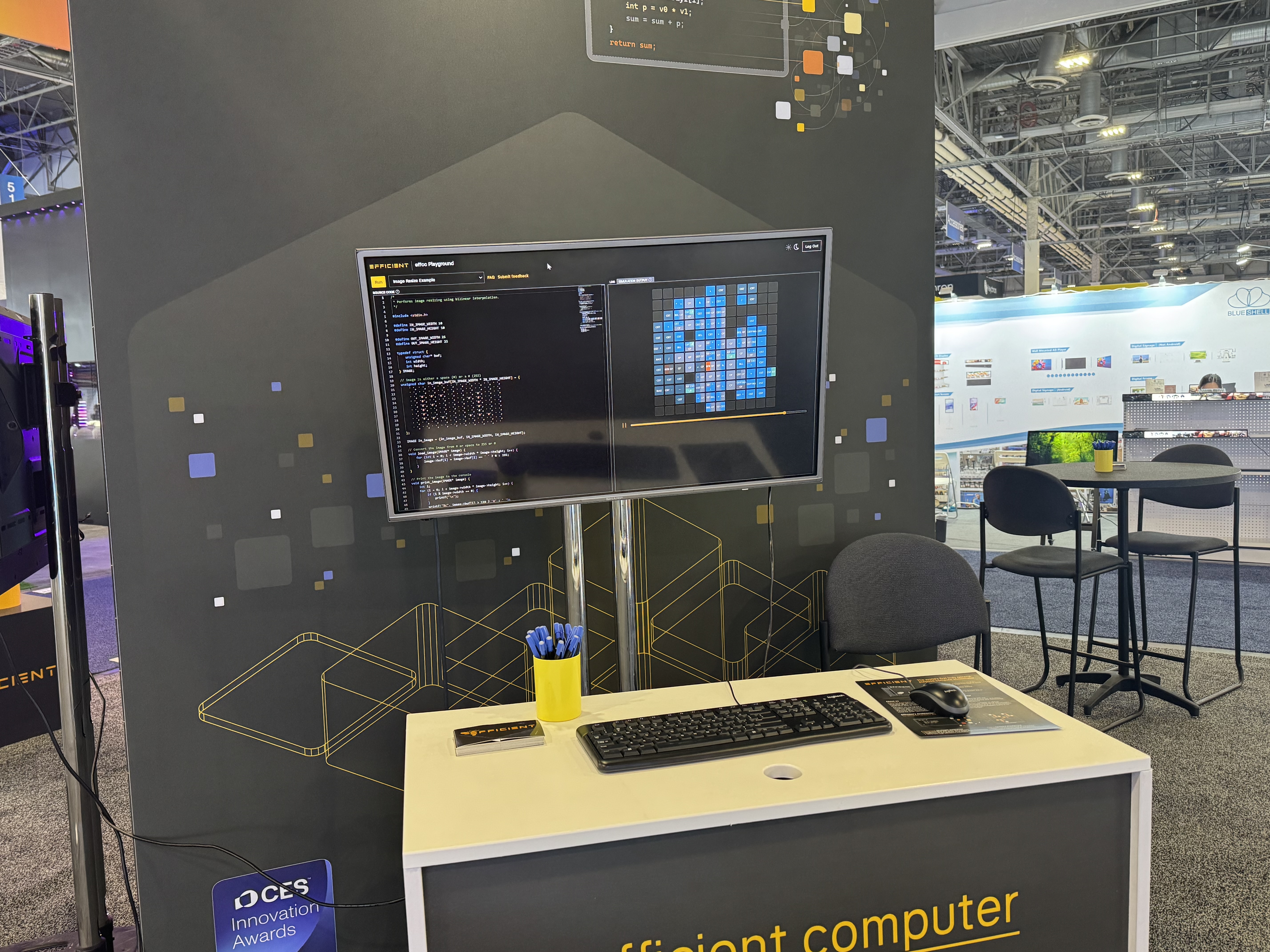
Next, we needed to provide a code editor for the user to enter their C program. We decided to use Monaco, which is the editor portion of the popular Visual Studio Code environment. This gave us code coloring and symbol identification. Here's what it looks like:
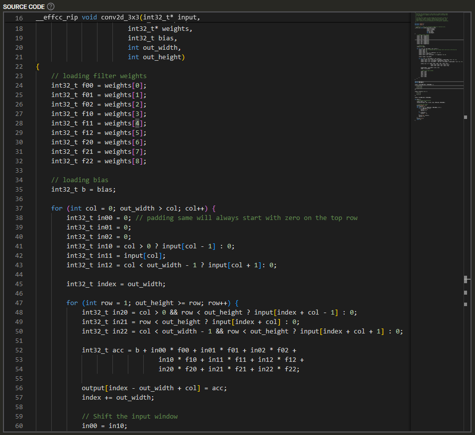
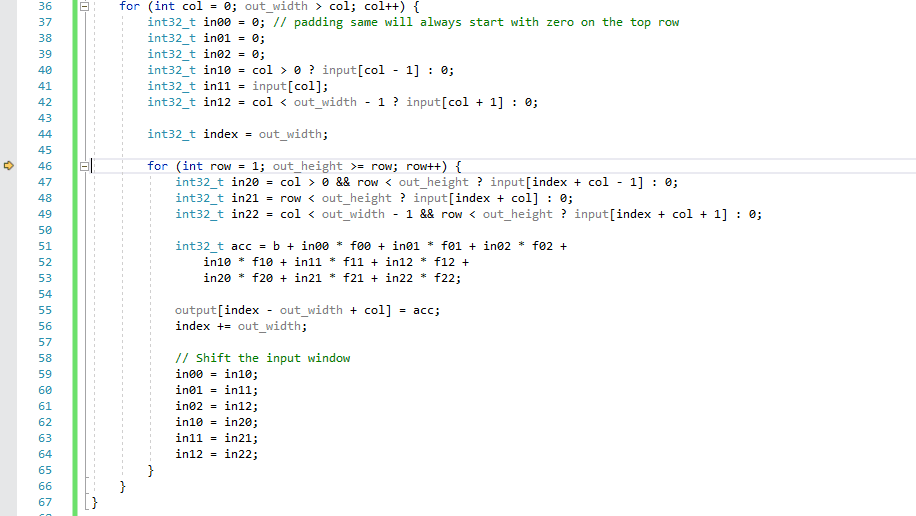
How Traditional Processors Work
Our next challenge was creating the visualization. The vast majority of processors execute instructions step-by-step, which is straightforward to illustrate. For example, here's how an Intel or AMD or Qualcomm chip would execute the code in a loop in a C program:
Visualize: Parallel Dataflow
In contrast, a dataflow processor looks for data dependencies - it distributes data values to its processing elements and routes the results to the next place that needs to process it, finally concluding when there are no more inputs to be processed. We explored the trace file the instrumented program creates when it runs. We worked with the compiler team to understand exactly how the various values are used. We created a series of mockups to explore possible representations. We found that each element would use no more than 3 different commands for different functions, and each command would output no more than two values. The physical representation is a grid, so we used a grid visually as well. Then we drew arrows to show the route of particular values from their operation to their target processing elements:
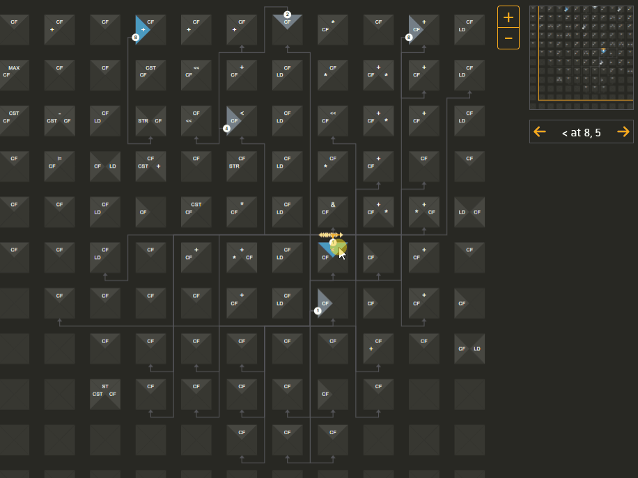
The target of the arrows shows the next instruction which will happen in a later time period, which you can jump to by clicking on the target instruction location the arrow is pointing to. This allows you to explore the entire program flow using whatever path you want.
Try it out!
The Playground was showcased at CES in January, and people really connected with what was going on.
If you'd like to see it live, you can
request access to the online playground and look at it yourself!